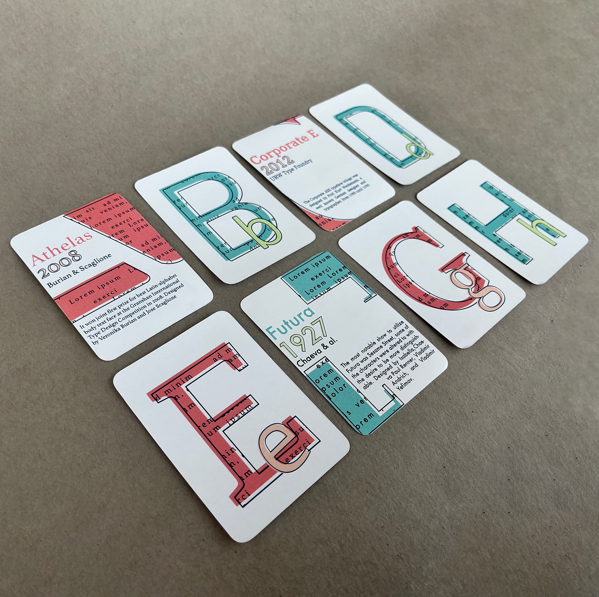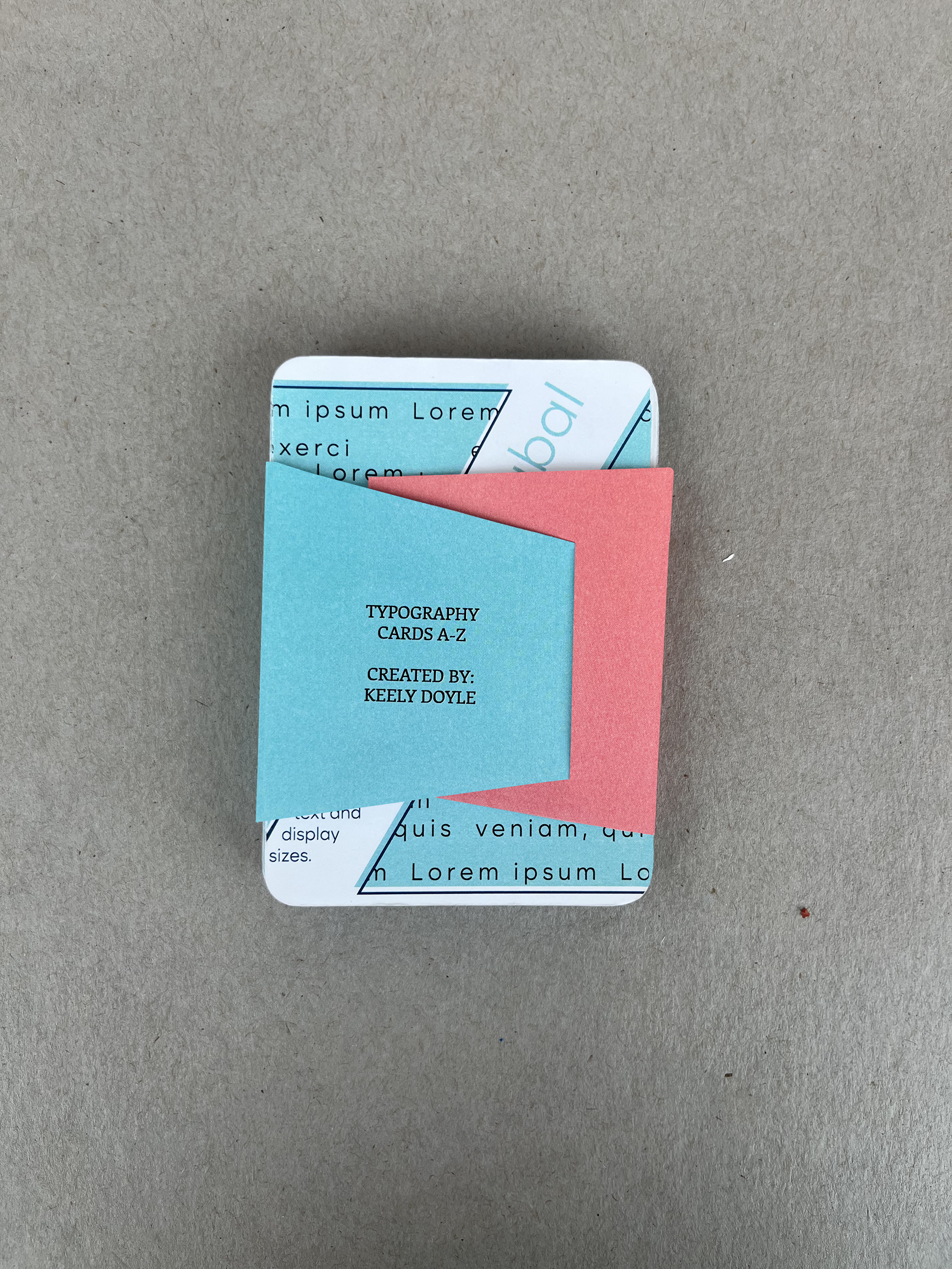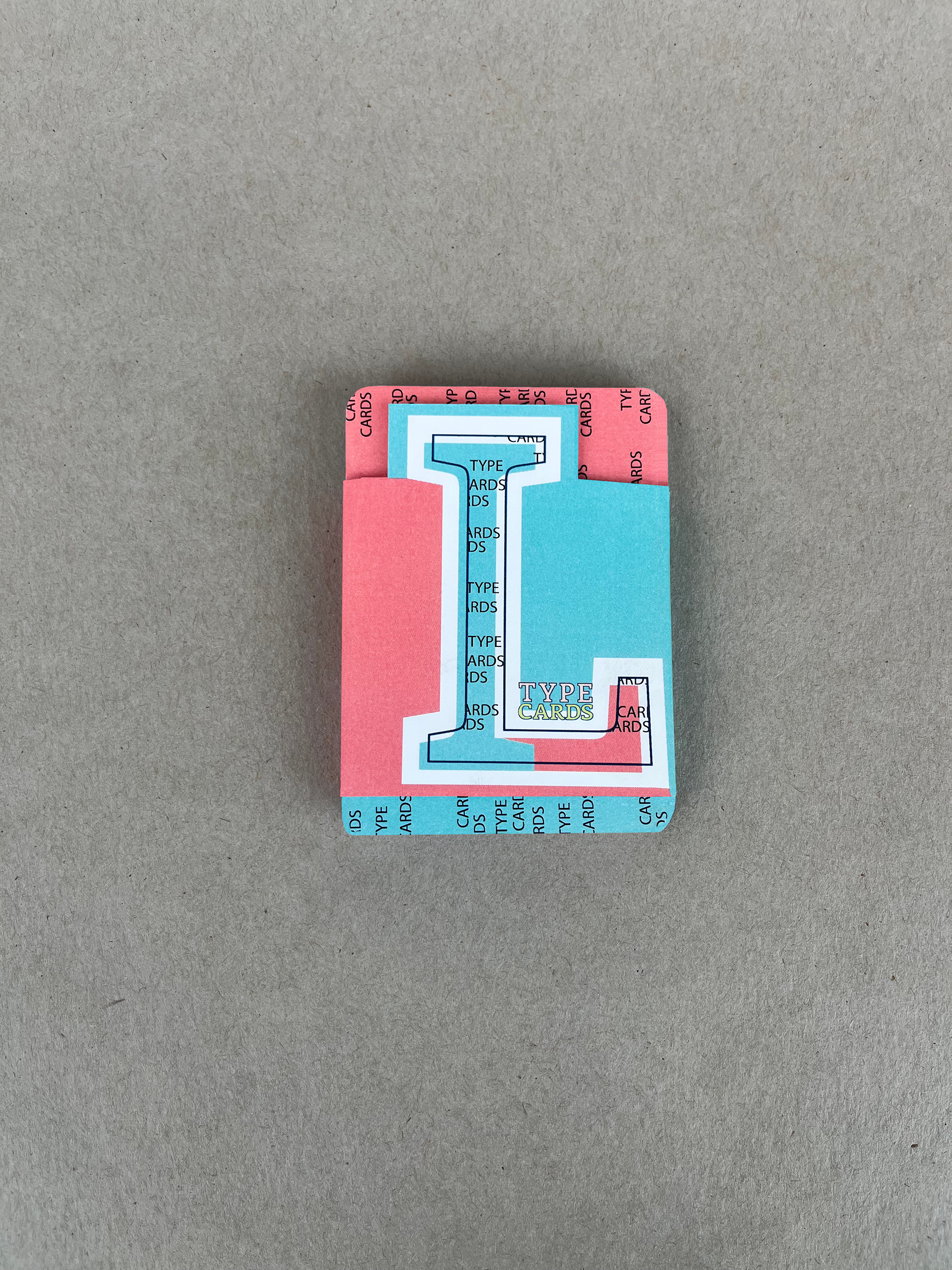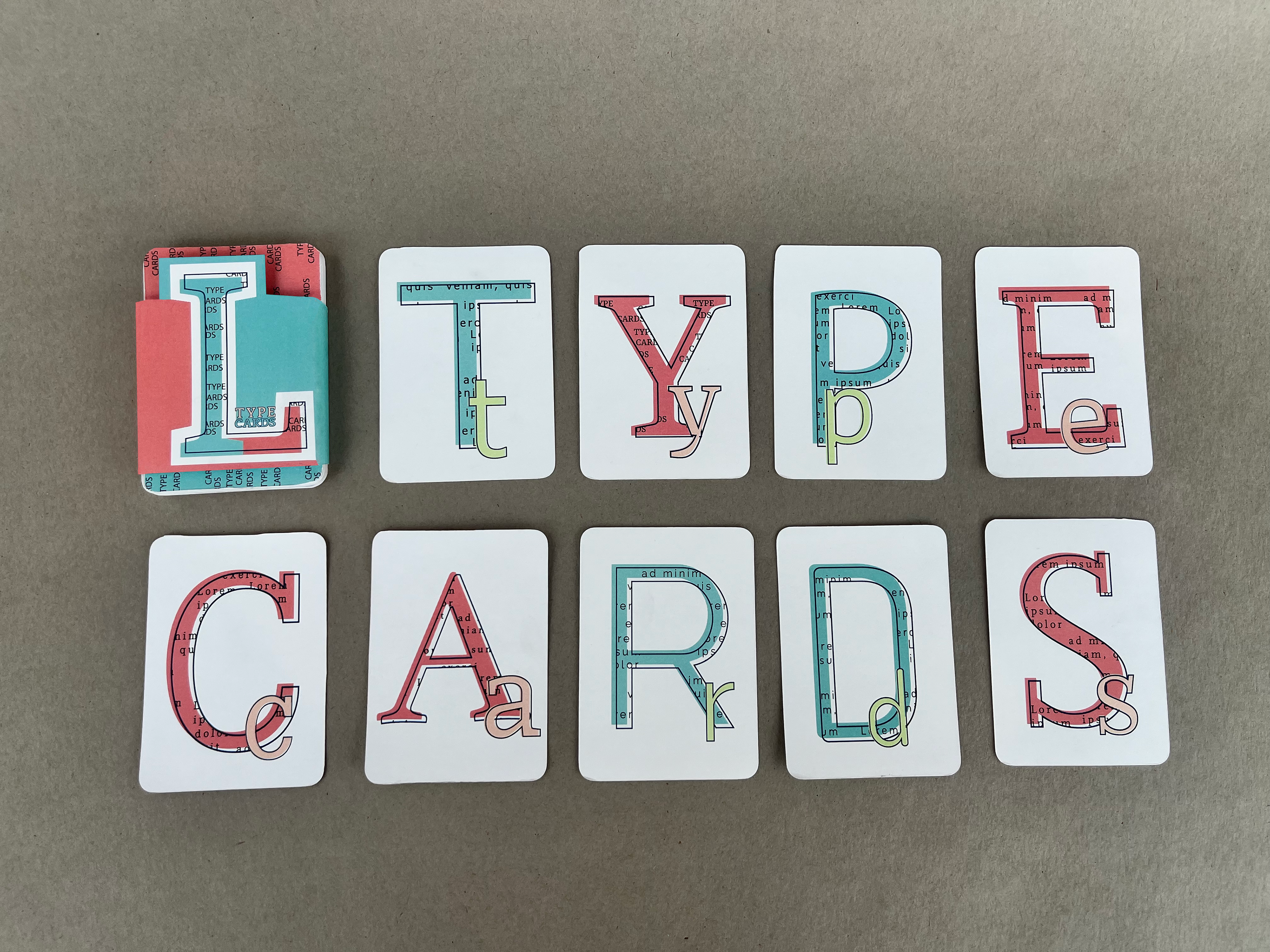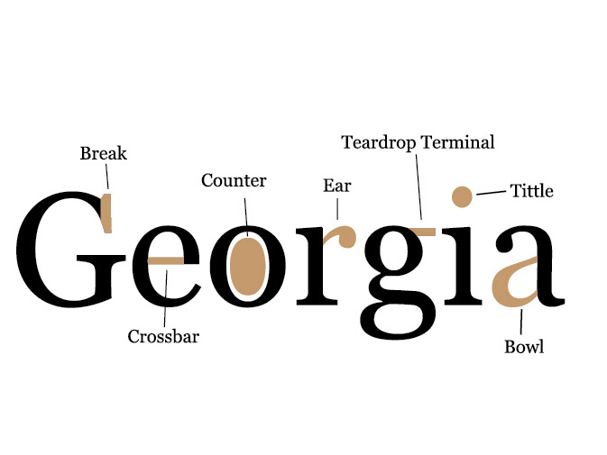

To familiarize myself with different fonts, I designed typography cards. There is one card for each letter of the alphabet with a font that starts with the corresponding letter. For example, card A represents the font Athelas. I played with the use of negative space and patterns. The cards alternated serif and sans-serif fonts, characterized by color differences. Each card has the name of the typographer who created the font, its date, and a fact about the font. This project required me to consider brand identity from the belly band to the individual cards. While also creating subcategories that fit into the brand. I also strengthened my prototyping skills by cutting out the cards with proper alignment.