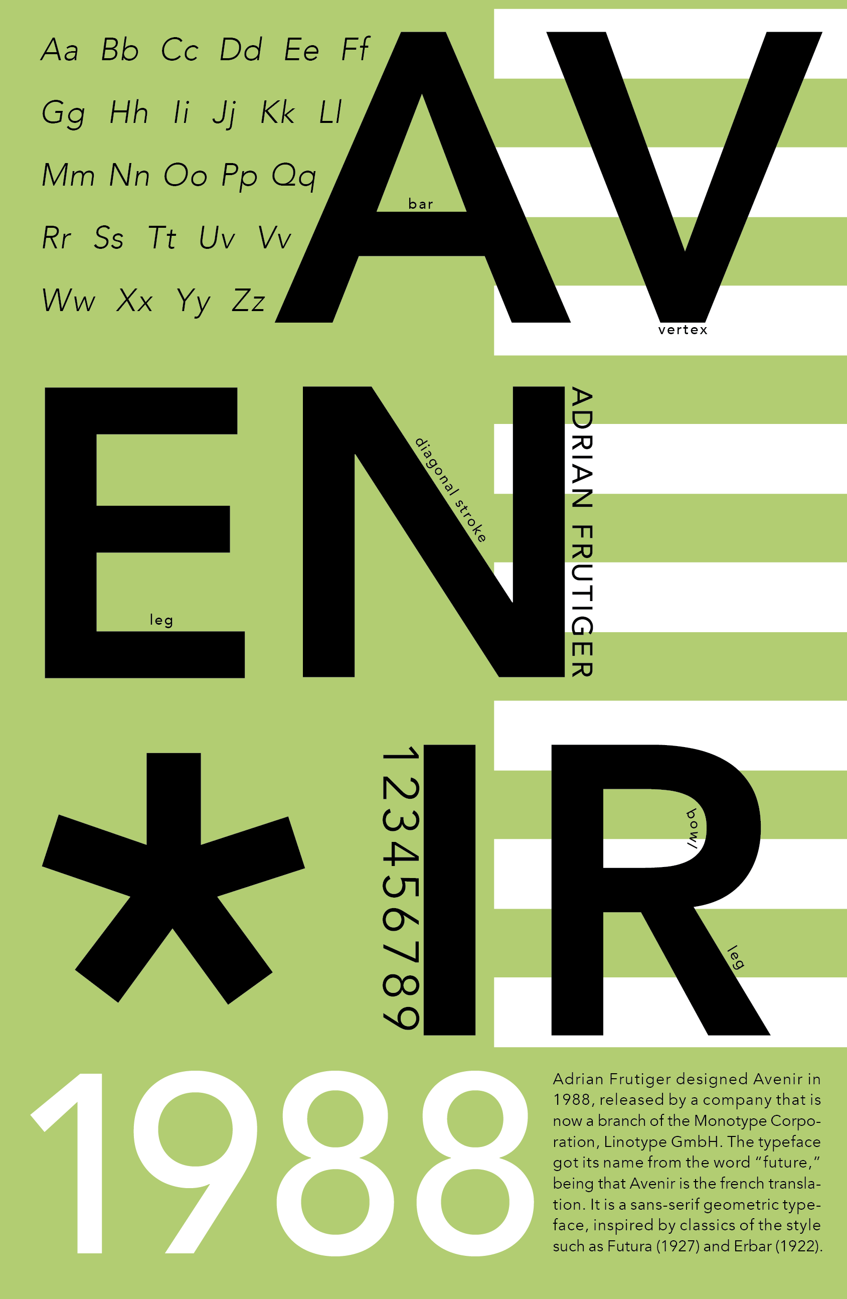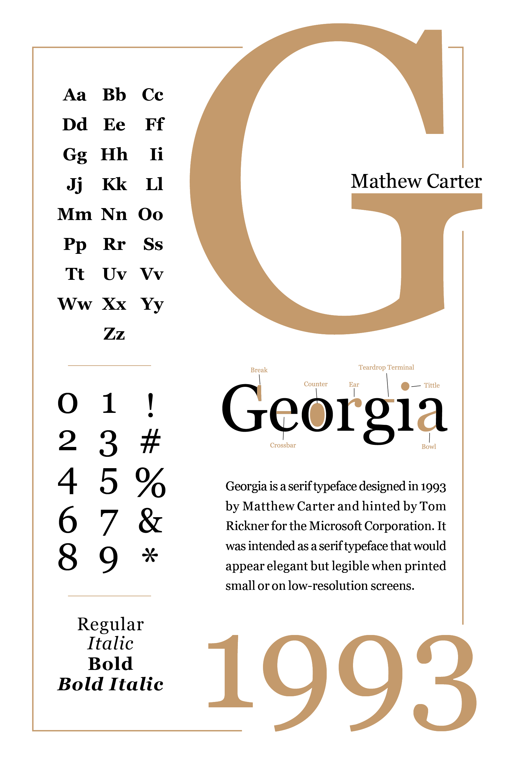

These are 11" by 17" posters to inform others about typography. I choose to show Avenir a sans-serif and Georgia a serif font. I wanted to show two diverse aesthetics. Avenir is bold and powerful, while Georgia is sophisticated and organized. With these posters, I had to think about layout and organization. They each contain the name of the font, the typographer's name, the date it was made, the entire alphabet, multiple weights, and a blurb about the font. On Georgia, I made a visual for viewers to see the anatomy of the font.